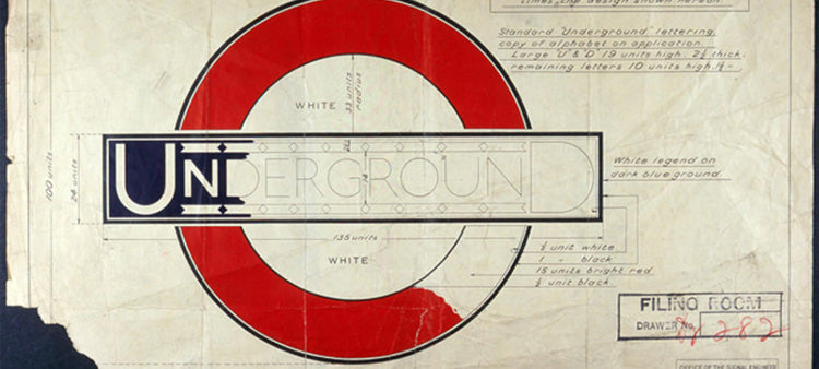

Commissioned by London Underground's commercial manager Frank Pick in 1913 to revise the Underground logo, Edward Johnston worked for nearly two years to create a new design for the London Underground brand to reform its corporate identity and font type.
The Johnston typeface was originally created for printing but it was soon used on the enamel London Underground station signs too. It has been used as the corporate font for public transport in London since 1933 and is one of the world's longest-lasting corporate design examples. The capitals of the typeface are based on the Roman square capitals and the lower-case on traditional serif fonts.
In 1979 the Johnston sans typeface was redesigned by Eiichi Kono at Banks & Miles and was renamed New Johnston. After nearly 1000 hand-drawn letters were refreshed by Kono, they were sent to AlphaType for digitisation in 1981. The New Johnston font appeared exclusively across London Underground stations in 1983.
Introducing Johnston100 for TfL
In 2016 a new derivation of the font was commissioned by Transport for London and would be known as Johnston 100 to commemorate the 100th anniversary of the original typeface. It includes two new weights, 'Hairline' and 'Thin' for digital use as well as new symbols such as the hash or hashtag character #. This font is said to be closer in style to the original Edward Johnston typeface.
London Underground Collections (LU Collections) under official license from Transport for London, has created several unique design pieces based around this amazing and timeless font. The Johnston 100 Collection is ageless, modern and beautiful featuring Johnston Sans, one of the most recognisable typefaces in the world. More than a hundred years later, our designs celebrate this most revered and enduring typeface, and its arrival into a new era.